How to Master Color Grading Basics: A Step-by-Step Guide for Filmmakers 2025
When given an opportunity, deliver excellence and never quit.
-Robert Rodriguez
How to Master Color Grading Basics: A Step-by-Step Guide for Filmmakers 2025
Video color grading can revolutionize your low-budget film into a professional-looking masterpiece that stands out at film festivals. As a color grader, your role extends far beyond simple color editing and esthetic improvements. Your independent films or commercial content need skilled video color editing to enhance storytelling and create powerful emotional responses from viewers. Warm tones evoke nostalgia, while cool tones build tension – your narrative’s success depends on effective use of color.
Raw footage’s transformation into a polished final product demands understanding of both video color correction and color grading. Color correction balances exposure, saturation, and white balance. Color grading advances your footage by establishing mood, time of day, and visual themes that support your story.
Would you like to revolutionize your filmmaking skills with professional-grade color grading techniques? Let’s take a closer look at what you need to know about this vital post-production process.
What is Color Grading and Why It Matters
“Color creates, enhances, changes, reveals and establishes the mood of the painting.” — Kiff Holland, Canadian watercolor artist
Color grading is the life-blood of post-production, setting itself apart from simple color adjustments. This artistic process shapes your footage’s visual tone and atmosphere, adding depth and style that improves storytelling.

Understanding color grading vs color correction
The difference between color correction and color grading is crucial to understand in the post-production workflow. Color correction focuses on technical accuracy – fixing exposure issues, adjusting white balance, and maintaining consistent colors across scenes. Color grading goes beyond these technical adjustments to create specific moods and emotional responses through artistic color manipulation.
Color correction creates a clean canvas that makes footage look natural and true to life. Color grading adds artistic brushstrokes that revolutionize this canvas into a compelling visual story. You can emphasize certain hues, create consistent visual tones, and build a distinctive atmosphere throughout your project.
Impact on storytelling and mood
Color grading is a powerful storytelling tool that guides audience emotions and builds narrative tension. Here are its key effects:
Emotional Response: Different color palettes trigger specific psychological responses. Warm tones like reds and yellows symbolize passion or energy, while cool tones such as blues and greens reflect calm or tension.
Scene Enhancement: Careful color manipulation turns ordinary scenes into extraordinary moments. Color grading helps showcase elements that might be nowhere near possible to capture during filming – like making daytime footage appear as nighttime or turning a bright forest into a dark, foreboding setting.
Color grading’s psychological effects go beyond esthetics. Each color choice sends specific messages to your audience. To name just one example, see films like “American Beauty” that used increased red tones during dramatic moments to show passion and power, while “Maleficent” used green to convey danger and corruption.
Color grading shines especially when you have to establish time periods, locations, and atmospheric conditions. A washed-out, desaturated palette creates an antiquated feel that works well for historical settings, particularly when audiences connect that era with black and white imagery.
The process needs both technical knowledge and creative principles. The core team uses this expertise to ensure every frame adds meaning to the narrative. Precise color manipulation creates sensory connections that deepen your story’s emotional impact.
Today’s color grading software and plugins offer countless possibilities for visual storytelling. These tools help craft immersive cinematic experiences where each frame contributes to the narrative. Notwithstanding that, successful color grading depends more on understanding color psychology and its emotional impact than technical skills alone.
Note that color grading choices should always support your story’s needs. The aim isn’t just making footage look good but creating a unified visual experience that strengthens your narrative themes and emotional beats.
Find Editing Jobs With FilmLocal
Essential Tools for Color Grading
Professional tools and technical knowledge work together to help you master color grading and achieve a cinematic look. Every tool from software to monitoring equipment is a vital part of your color grading workflow.
Basic software options
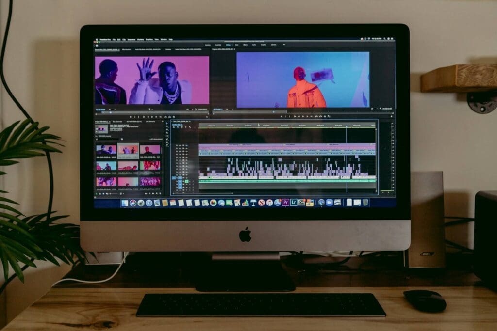
When it comes to the best color grading software, DaVinci Resolve stands out as a complete solution that gives you powerful color tools for color correction, visual effects, and audio post-production. The software has auto-balancing features and FX plug-ins for preset filters. Adobe Premiere Pro’s Lumetri Color panel lets you make precise adjustments to white balance and skin tones, among other one-click corrections that optimize workflow. Adobe color correction tools are particularly user-friendly for beginners.
Final Cut Pro makes color grading accessible through color boards, curves, and HSL adjustments. ColorDirector gives beginners advanced grading tools to create professional results without needing years of experience. It’s often considered the best color grading app for those new to video editing.
Must-have features
Professional color grading software needs these vital capabilities:
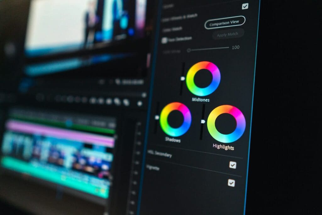
Color wheels for adjusting shadows, midtones, and highlights
Built-in filters and LUT support
Color matching tools for scene consistency
Mask effects and smart selections
Keyframe controls for dynamic adjustments
These features work best when you properly adjust and monitor your equipment. Professional monitors like the Flanders Scientific DM240 come pre-calibrated and offer lifetime re-calibration services.
Color scopes and monitors
Color scopes help you achieve technical accuracy. The main scopes include:
Waveform Monitor: Displays luminance distribution across the image to help identify bright and dark elements
Vectorscope: Measures color and saturation on a six-point color wheel to maintain consistent skin tones
Histogram: Shows the distribution of luminance values to ensure proper exposure balance
Professional color grading monitors must support advanced features like up-to-the-minute scopes, split-screen viewing, and pixel zoom functions. The Flanders Scientific DM240, priced at USD $4,295, has specialized tools like Real-Time Customizable Multi-Color Waveform and Parade analysis.
FSI’s XM310K monitors offer 3000 nits brightness capability for HDR workflows. Consumer alternatives exist but often have limitations in signal processing, screen uniformity, and color accuracy.
Project budgets and distribution requirements determine the need to invest in professional-grade monitoring to maintain quality standards and meet delivery specifications.
Setting Up Your Color Grading Workspace
A professional color grading workspace needs careful attention to detail and the right setup of everything. The right workspace design will give a precise color perception and consistent results in your projects.

Monitor calibration
You need specialized hardware tools called colorimeters to calibrate your monitor professionally. These devices measure your screen’s output and adjust it to industry standards. Your monitor should warm up for at least 30 minutes before calibration to ensure stable color output.
Key calibration settings include:
White point: Set to 6500K (D65) for video work
Gamma: Use 2.2 for bright rooms or 2.4 for dark environments
Luminance: Maintain 120 cd/m² for standard LCD screens
Your monitor’s color accuracy will drift naturally over time, so calibrate monthly. Built-in operating system calibration tools rely on subjective visual judgment, so it’s best to avoid them.
Room lighting
Your lighting environment plays a vital role in color perception. Professional colorists recommend:
Installing 6500K (D65) bulbs with Color Rendering Index (CRI) above 90
Painting walls with 18% neutral gray to eliminate color contamination
Adding bias lighting behind your monitor to reduce eye strain
Blocking natural light with blackout curtains or choosing windowless spaces
The size of your room affects workflow efficiency. Larger spaces fit client seating and leave room for future expansion. You should add comfortable seating and maintain appropriate desk space for your equipment.
Project organization
Good project organization makes your color grading workflow smooth. Here’s what you should do:
Group similar shots based on camera, location, or scene requirements
Create consistent naming conventions for grades and versions
Keep timelines organized with appropriate handles for transitions
Set up color management early in the project pipeline
Production teams should communicate clearly about desired looks and technical specifications before color work begins. Testing your complete project pipeline from image acquisition through final mastering helps spot potential issues early.
A dedicated color grading workspace with proper calibration, lighting control, and organization helps you achieve professional results. Regular maintenance of these elements keeps quality consistent across projects.
More Filmmaking Articles
Step-by-Step Color Grading Process
A systematic approach will give you professional results in color grading. Each step builds on the previous one and creates a solid foundation to realize your creative vision.
White balance adjustment
The first step is getting the white balance right to achieve accurate colors. You need to turn down saturation completely to focus on neutral tones. After setting the white balance, bring back saturation gradually to fine-tune the look. White balance cards or gray cards serve as reference points to maintain technical accuracy.
Exposure correction
With white balance in place, tackle exposure issues in your footage. Check the waveform monitor to spot areas that need adjustment. Your key focus should be:
Balancing overall exposure while protecting specific areas
Fixing blown-out highlights
Bringing up shadows without washing out the image
Color balance
Good exposure sets you up to work on color balance adjustments. Digital footage often has oversaturated elements, so watch those vibrant colors. We focused on skin tones since they usually need less saturation and cooler midtones.
Adding style
Your footage should now have a neutral, well-balanced foundation. This creative phase lets you bring your artistic vision to life. Here are some approaches to think over:
Creative LUTs to improve the overall esthetic
Power windows and masks for targeted adjustments
Secondary corrections for specific color ranges
Final touches
Subtle adjustments will unite all elements in your final grade. These modifications should flow through your project to create a cohesive visual motif. Film grain or subtle vignettes can improve your footage’s cinematic quality.
Note that you shouldn’t add any unique style until you complete the technical corrections. Make sure all shots in a scene match before moving forward. This approach gives you both technical excellence and creative freedom in your final grade.
Top colorists use this workflow in projects of all types. These steps are the foundations of solid technical work that lets your creative decisions shine in the final output.
Advanced Color Grading Techniques
“In nature, light creates the color. In the picture, color creates the light.” — Hans Hofmann, German-born American abstract expressionist painter
Color grading goes far beyond simple adjustments. Advanced techniques help tap into the full potential of your visual storytelling. You’ll have exact control over specific elements in your footage.

Working with LUTs
Look Up Tables (LUTs) make your workflow smoother by transforming color values mathematically. Start with a Viewing LUT that matches your camera’s format when working with Log footage. Balance exposure and white balance in the node before the Viewing LUT. Then add another node to apply creative LUTs that achieve your desired look.
Power windows and masks
Power windows give you targeted control over specific image areas without changing the whole frame. These color tools let you:
Create subtle vignettes that draw focus
Brighten or darken specific subjects
Apply corrections to specific areas
Complex scenes need a combination of power windows and qualifiers to avoid unwanted effects on other areas. Your masks should be tracked to keep adjustments consistent throughout moving shots.
Secondary corrections
Secondary color grading lets you adjust specific elements after your primary corrections are done. This technique is crucial when you need to:
Fine-tune skin tones
Modify specific color ranges
Boost particular scene elements
HSL qualifiers help isolate colors based on hue, saturation, and luminance values. You can combine these qualifiers with power windows to get precise control over complex adjustments.
Adding film grain
Film grain adds organic texture and depth to digital footage. Here’s what you need to know:
Pick grain size that fits your camera format
Put grain before creative look components
Keep grain subtle – it should be felt rather than seen
Real film scans work better than digital simulations for authentic results. Grain nodes should be placed at the Timeline level to keep all shots consistent. The grain intensity needs adjustment based on exposure levels and scene lighting for a natural look.
These advanced techniques give you precise control over your footage’s visual elements. Each adjustment should support your story’s needs and create a cohesive visual experience that boosts your narrative.
Common Color Grading Mistakes to Avoid
Professional colorists make common mistakes that can reduce their work’s quality. Learning about these errors helps you maintain high standards in your color grading process.
Oversaturation issues
Digital footage comes with naturally oversaturated elements that need careful handling. Increasing contrast automatically adds saturation to your image. Here’s how to tackle this problem:
Keep an eye on your vectorscope while adjusting contrast
Reduce global saturation step by step
Use HSL curves to fix specific color problems
Oversaturated colors often create solid blocks or fringing around bright elements, which particularly affects LED lights. These problems show up in cameras of all types, from smartphones to professional gear.
Inconsistent grades
Your viewers stay immersed when scenes look consistent. Good shot matching needs:
A wide or medium shot as your baseline ‘hero shot’
Matched contrast, saturation, and white balance between adjacent shots
Consistent exposure levels throughout scenes
Start by balancing each shot individually and fix obvious exposure issues or color casts. This foundation lets you match all shots in your film to create a cohesive look.
Poor skin tones
Viewers quickly spot unnatural skin tones, so keeping them realistic is vital. The vectorscope’s skin tone line shows ideal representation – skin follows similar tones across all complexions, but saturation levels change.
These saturation levels work best for different skin types:
Asian complexions: Up to 50% saturation
Dark skin: Generally under 45% saturation
Light skin: Typically below 30% saturation
Best results come from skin tone luminance between 40-70 IRE. Red tints on faces can cause banding issues, but HSL curves help remove extra red without adding green tints.
Knowledge of these common mistakes, combined with proper monitoring tools and techniques, helps you maintain professional standards in your color grading work. Your grades should enhance your story without drawing attention to technical flaws.
🎥 Master Film Editing Like a Pro
Learn industry-standard editing techniques, software tips, and workflow strategies from top professionals—whether you’re a beginner or looking to level up.
By signing up, you agree to receive emails from FilmLocal. You may also receive relevant offers from trusted partners. Opt-out anytime. Privacy Policy
Ready to Color Grade?
Color grading is a powerful tool that turns ordinary footage into compelling visual stories. You can lift your films beyond simple color correction by understanding the color tools, setting up your workspace properly, and following systematic processes. This creates emotionally resonant experiences.
Creating great results needs attention to technical fundamentals. You should avoid common pitfalls like oversaturation and inconsistent grades. The process starts with simple corrections. You can master advanced techniques gradually and prioritize your story’s needs instead of chasing trendy looks.
Professional color grading combines technical expertise with artistic vision. Each project is a chance to refine your skills and develop your unique style while following industry standards. These fundamentals will help you approach color grading confidently as an integral part of your filmmaking experience.
While you’re at it, you should check out more of FilmLocal! We have plenty of resources, and cast and crew. Not to mention a ton more useful articles. Create your FilmLocal account today and give your career the boost it deserves!


